Leading brands in
the architecture and
interior design industry
the architecture and
interior design industry
Become dominant through strategic branding and design culture. We are the partner beside the world’s premier brands in the niche:
Empowering the industry through the
transformational power of branding.
GERMANY
CANADA
CHINA
SPAIN
MÉXICO

SPAIN
SPAIN
ITALY
SPAIN

TURKEY

SPAIN

ECUADOR

SPAIN

SPAIN

SPAIN

INDIA

SPAIN
SPAIN
Our brands thrive with Impact, Reach, and Revenue driven by our two primary pillars: Design Culture and Targeted Strategies.
Our brands thrive with Impact, Reach, and Revenue driven by our two primary pillars: Design Culture and Targeted Strategies.
Design Culture
We know the power of design for businesses and people. We introduce design culture in every aspect of the companies we partner with.
Our brands are industry trendsetters.
Targeted Strategies
Strategies work when they are based on the current state of the industry.
We stay connected with our audience’s preferences, identify industry opportunities, and guide our brands to secure a leading position in their respective niches.
Let our
work speak
about us

Bathroom Equipment
Coatings
Construction Finishings
Exhibition
Hardscaping
PVC Flooring
Tile Industry
The expansion of an event dedicated to architecture and interior design
Bathroom Equipment
Coatings
Construction Finishings
Exhibition
Hardscaping
PVC Flooring
Tile Industry
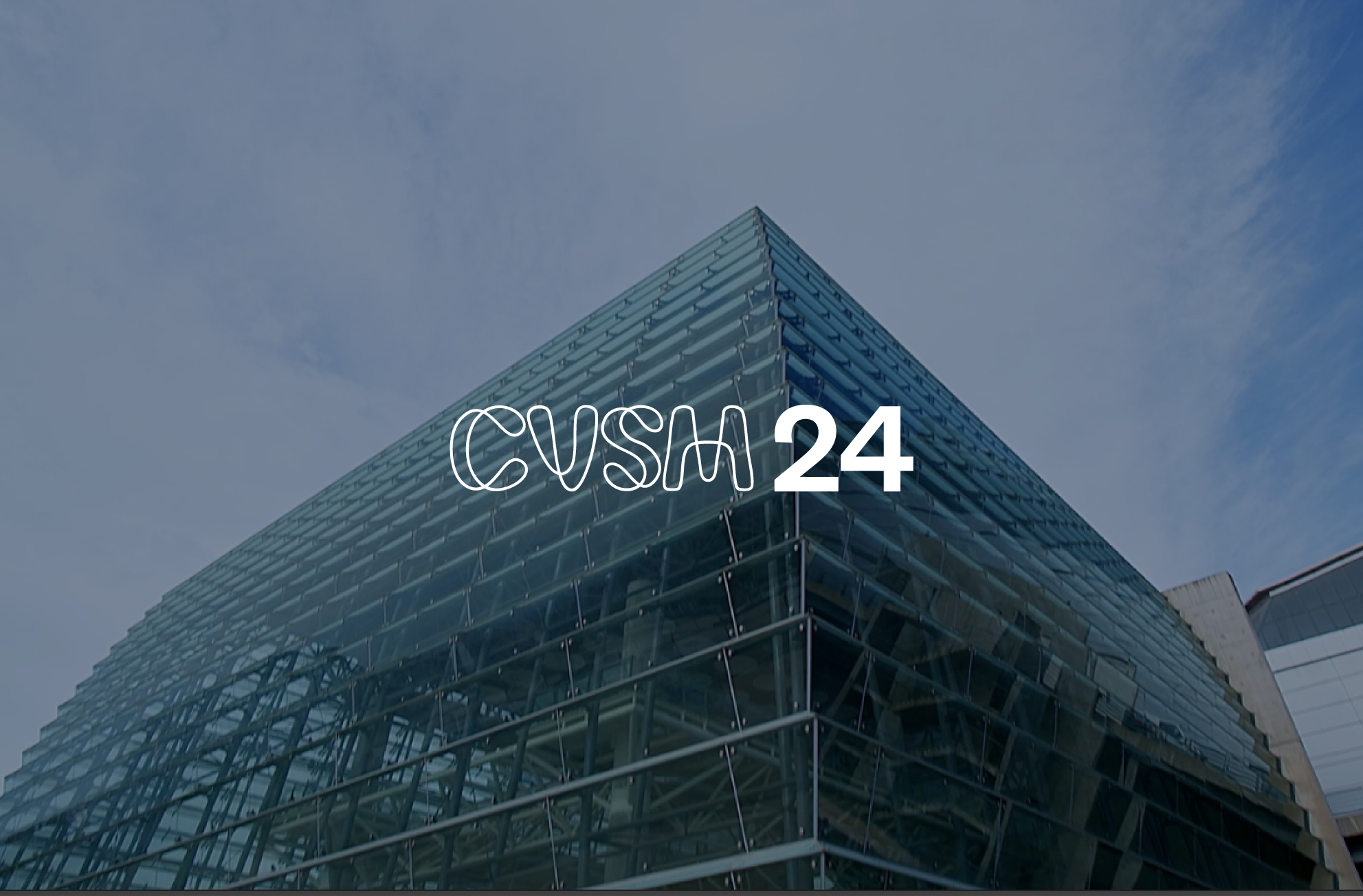
The 40th anniversary of an event that marks de history of ceramics in Spain
Bathroom Equipment
Coatings
Construction Finishings
Exhibition
Hardscaping
PVC Flooring
Tile Industry
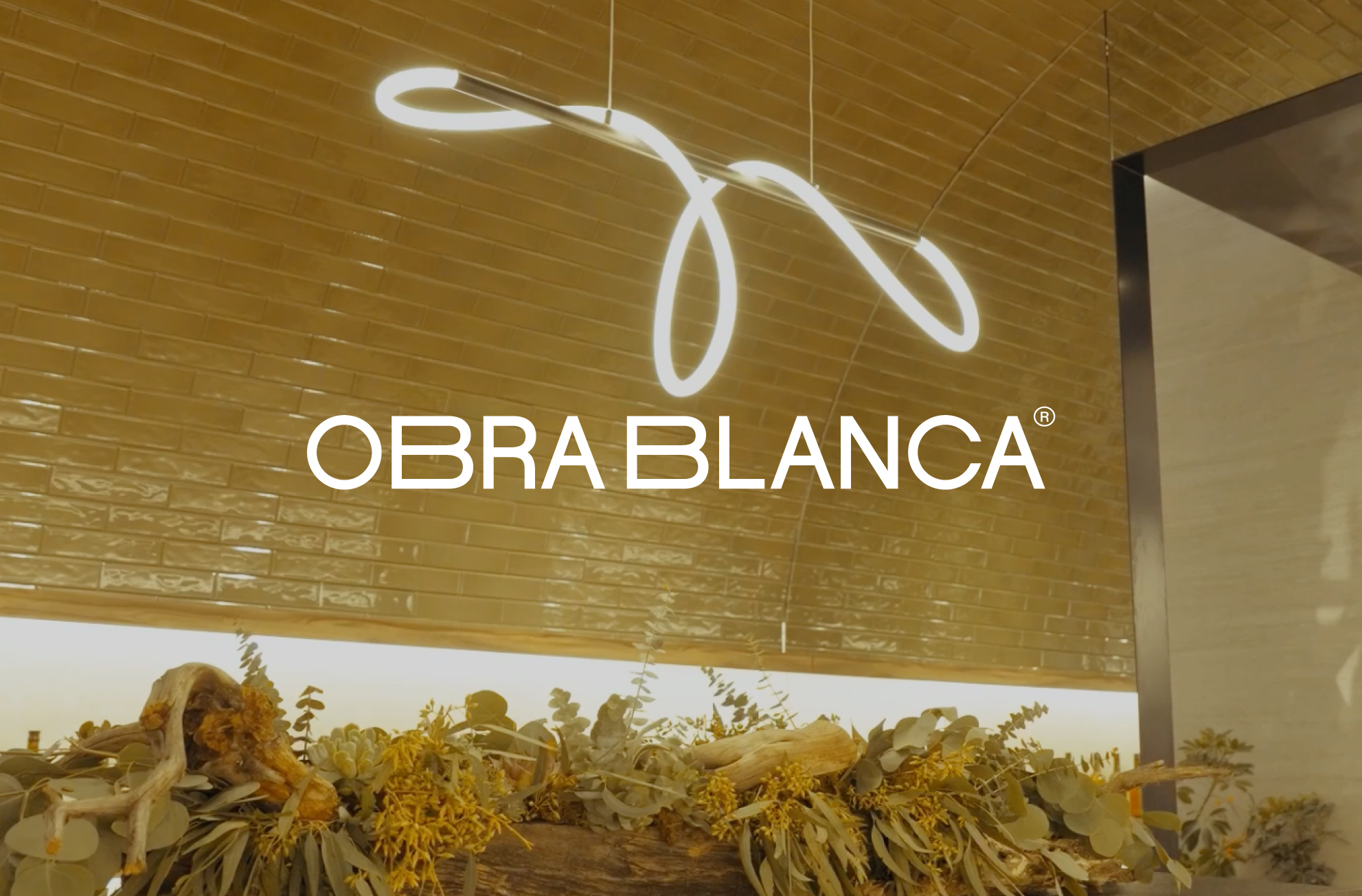
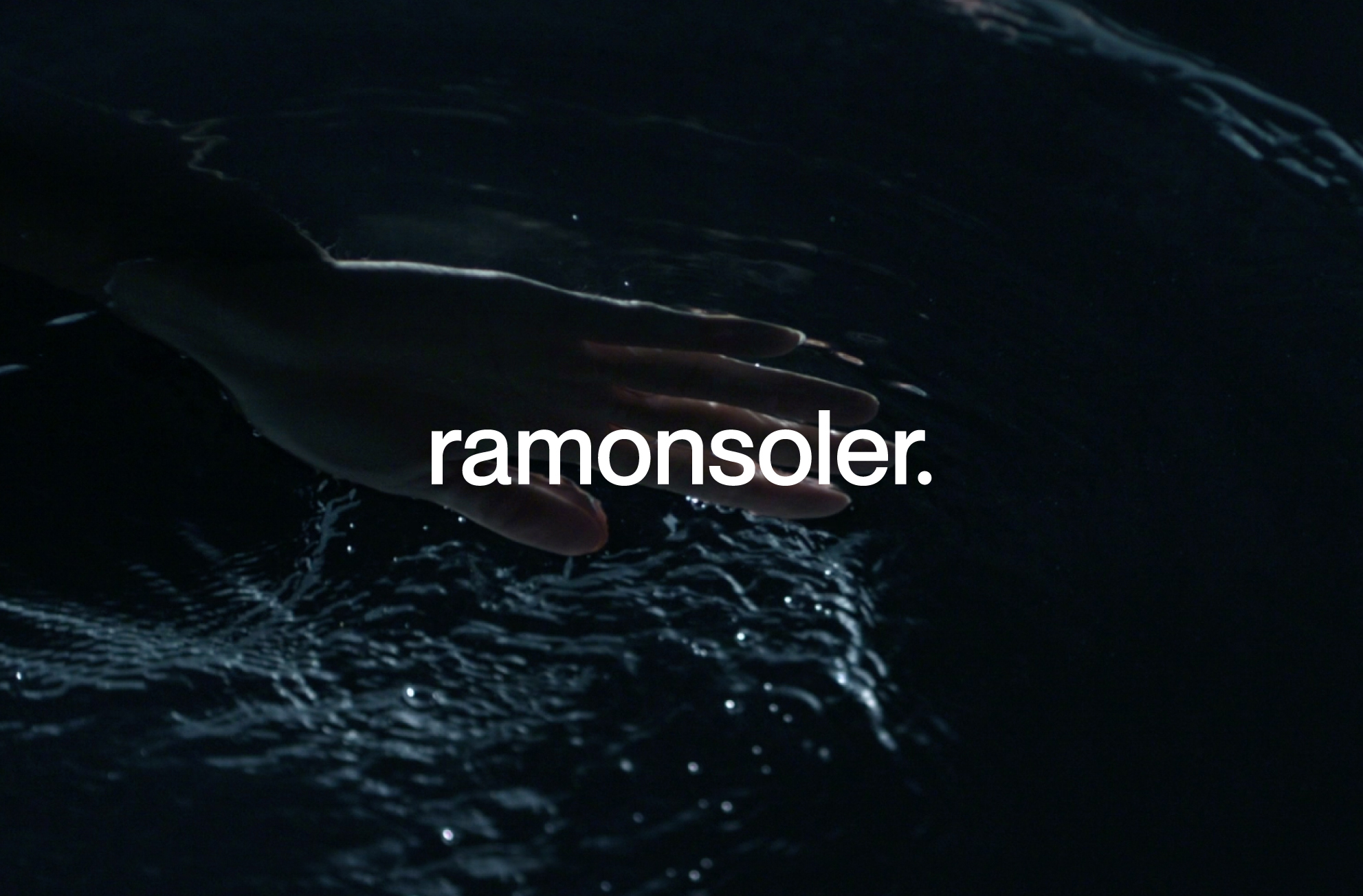
A brand inspired by the infinite spectrum of water's hues
Bathroom Equipment
Coatings
Construction Finishings
Exhibition
Hardscaping
PVC Flooring
Tile Industry
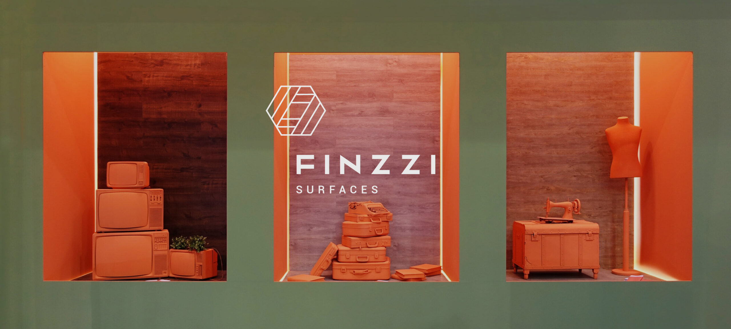
A high performance coverings brand with Italian heritage
Bathroom Equipment
Coatings
Construction Finishings
Exhibition
Hardscaping
PVC Flooring
Tile Industry
Liquid luxe: A brand immersed in water's pleasures
Bathroom Equipment
Coatings
Construction Finishings
Exhibition
Hardscaping
PVC Flooring
Tile Industry
Enhancing the unlimited possibility to create
Bathroom Equipment
Coatings
Construction Finishings
Exhibition
Hardscaping
PVC Flooring
Tile Industry
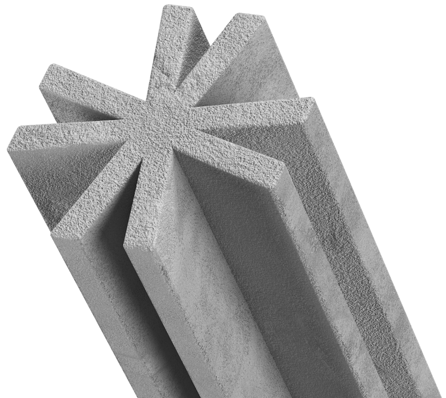
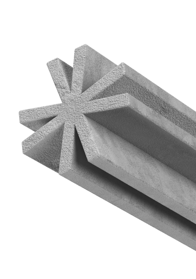
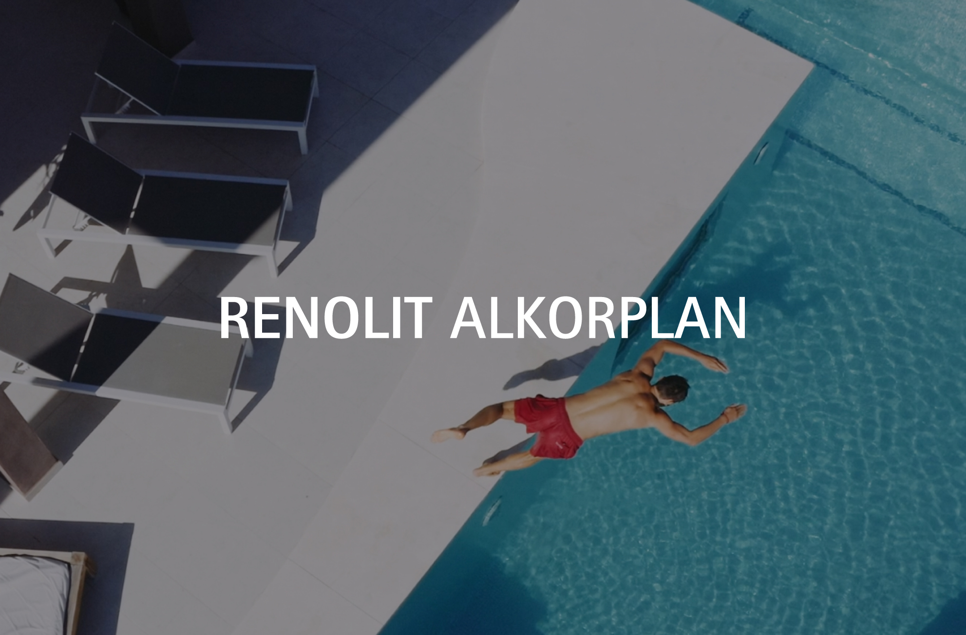
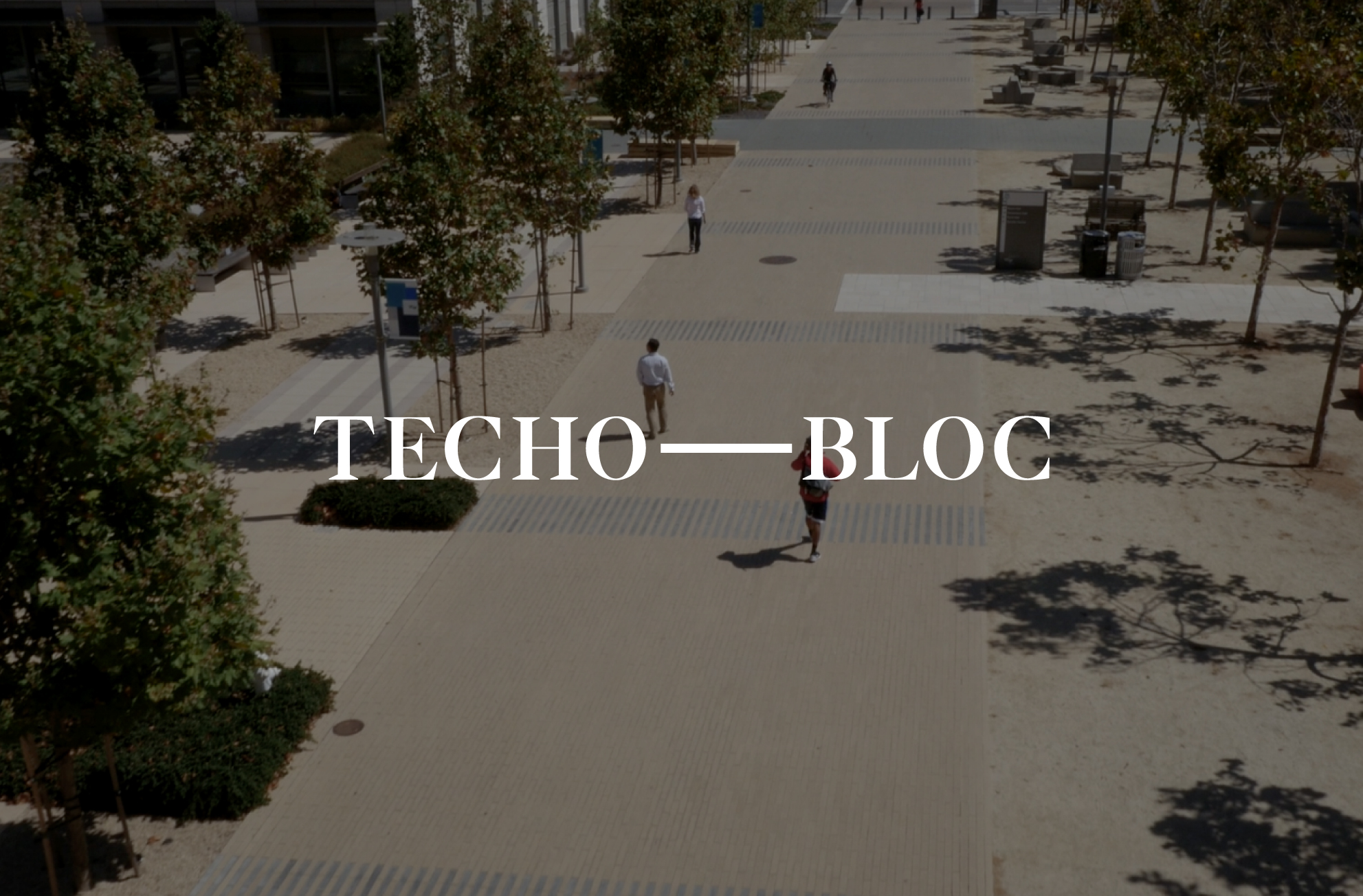
Shaping the future of the finishing materials industry
Bathroom Equipment
Coatings
Construction Finishings
Exhibition
Hardscaping
PVC Flooring
Tile Industry
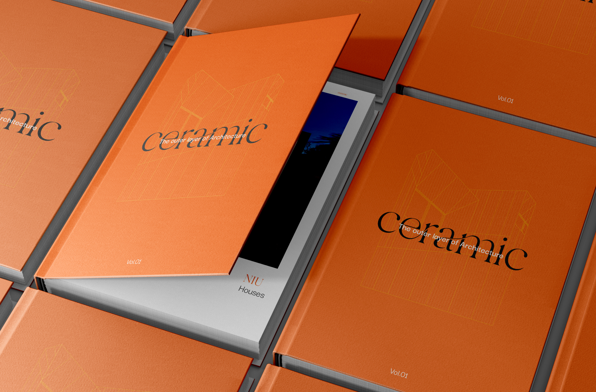
Unleashing "Ceramic": The transformative potentials of tiles in a book
The
Discovery
Journey
A transformative 3-day consulting journey where businesses discover a clear path to unlock endless possibilities for their brands.

A touch of VXLAB
in your inbox
Subscribe to our newsletter:
X