the architecture and
interior design industry


We know the power of design for businesses and people. We introduce design culture in every aspect of the companies we partner with.
Our brands are industry trendsetters.
Strategies work when they are based on the current state of the industry.
We stay connected with our audience’s preferences, identify industry opportunities, and guide our brands to secure a leading position in their respective niches.

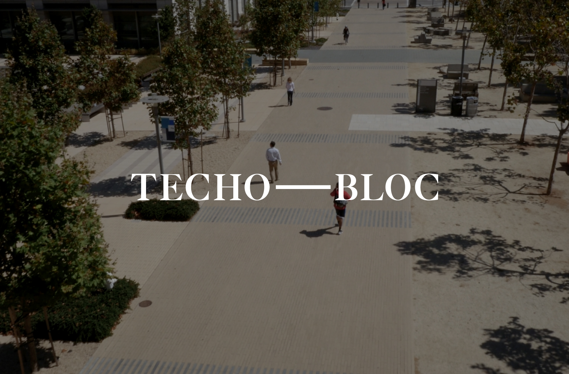
“They were able to capture the soul of Techo Bloc, when they presented the visual system for a rebrand, and that was something that really blew us away, how did they get it so quickly? We tried and tried for years with other partners and agencies, and VXLAB really takes the time to dive into your brand and they deliver a visual system that speaks to the soul of your brand.”

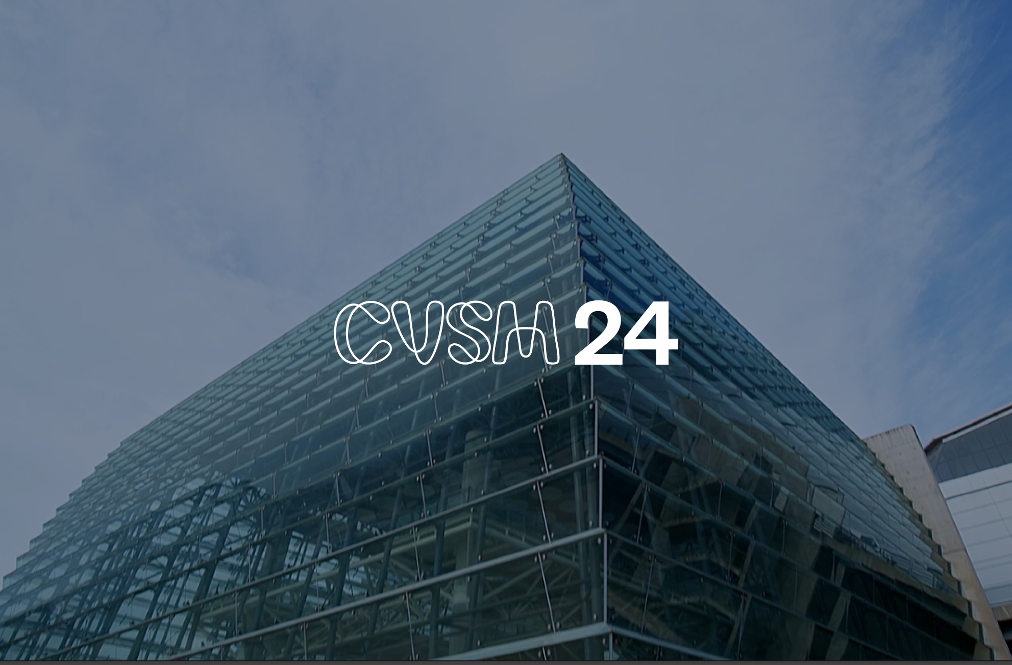
“Right from the start of our partnership, they grasped the core of Cevisama and understood what we aimed to communicate to our clients. They crafted a completely meaningful, groundbreaking identity that they consistently evolves with each edition. VXLAB boasts a team of highly skilled professionals, and at Cevisama, we’ve consistently admired their creativity and swift responsiveness“

“We have received from VXLAB a professional job, with detailed and high-quality monitoring, yielding tangible results and fulfilling the commitments made”

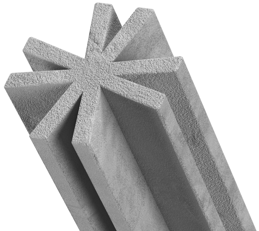
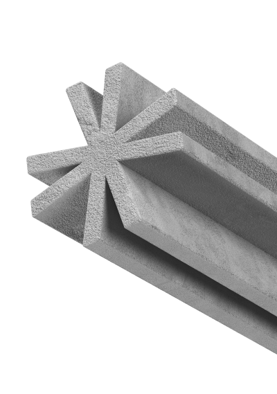
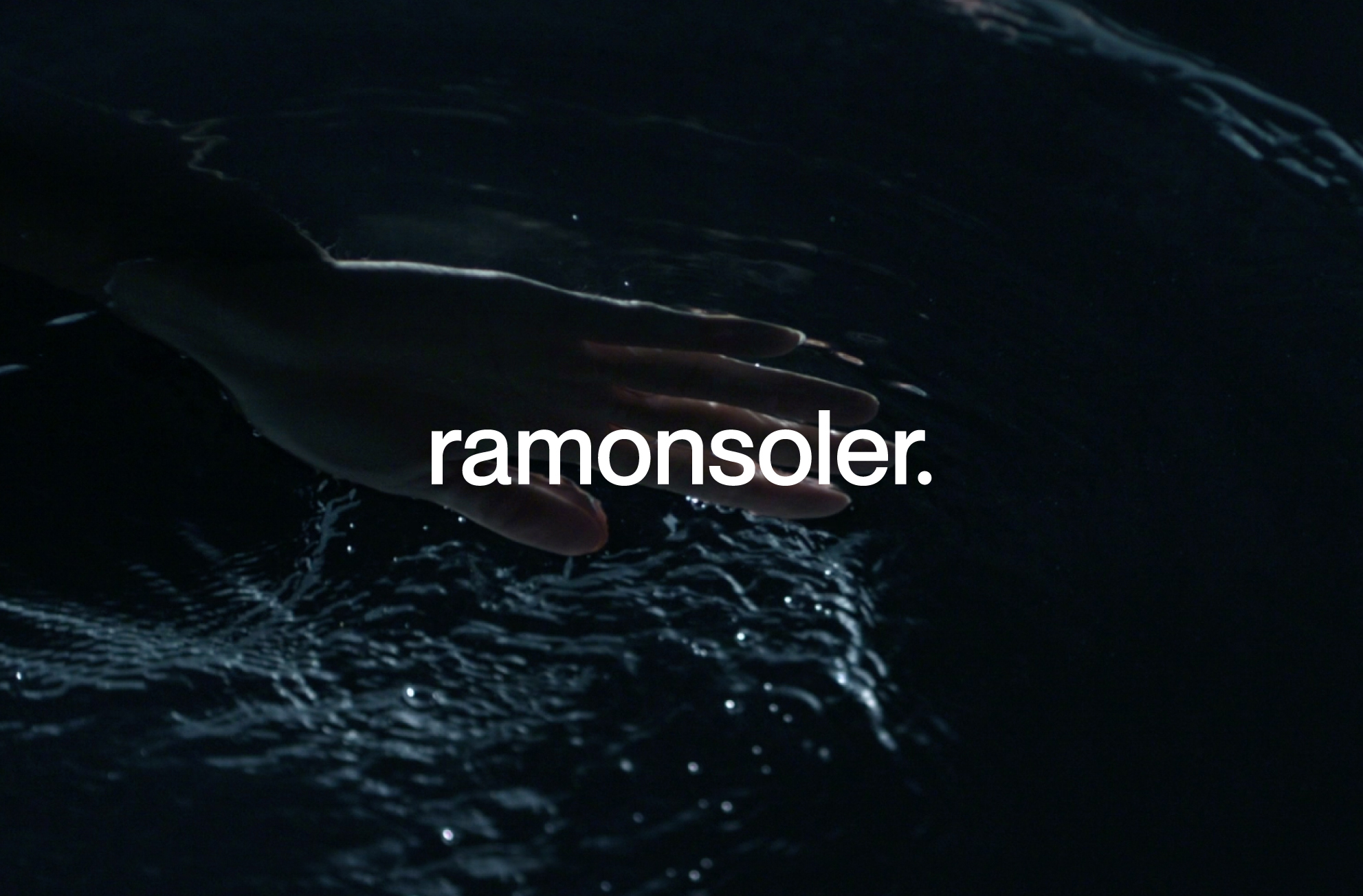
“The new branding for Ramon Soler has been enthusiastically and wholeheartedly embraced by the entire company staff. Among our clients, it has been perceived as a highly positive evolution of the company, increasing trust in Ramon Soler across all our national and international markets. A testament to all this is the prestigious international German Design Award recently received for the new Ramon Soler branding”